★ KAI ★
Kai Jerzö
‘Jerzovskaja’
– Welcome to the here and now –
★ Perceiving and shaping ★
Color (4): Color Phenomena
The following section elucidates the fundamental principles of light colours and their significance as the basis of all colour phenomena. It explains the mechanics of additive colour mixing and why white and black hold unique roles in the system of light colours. The second part delves into the principles of material colours and subtractive mixing, illustrating how material colours arise from the interplay of light and substances, and how pigments and dyes are employed in the CMY system for printing and painting.
Light Colours and Additive Colour Mixing
Colours are created in the brain
Every colour is ultimately a product of the brain, which interprets the interaction of light waves with the human eye.
Light colours can exist independently of surfaces. For instance, the blue sky results from short-wavelength light scattered in Earth’s atmosphere when sunlight interacts with molecules and particles. This scattering (Rayleigh scattering) amplifies the blue component of sunlight.
Sources such as the Sun, stars, candles, fire, incandescent bulbs, and LEDs (found in displays, smartphones, lamps, and signalling systems) generate colours without requiring a reflective surface. The light waves emitted by these sources are directly received by the eye, processed by the brain, and perceived as colours.
Light Colours as Primary Phenomena
Light colours form the primary spectrum from which material colours emerge. When white light is refracted through a prism or other refractive medium, it separates into its spectral colours (red, orange, yellow, green, blue, indigo, violet).
These spectral colours underpin all light colours.
Additive Colour Mixing – The Fundamental Principle of Light Colours
Primary Colours in the RGB System
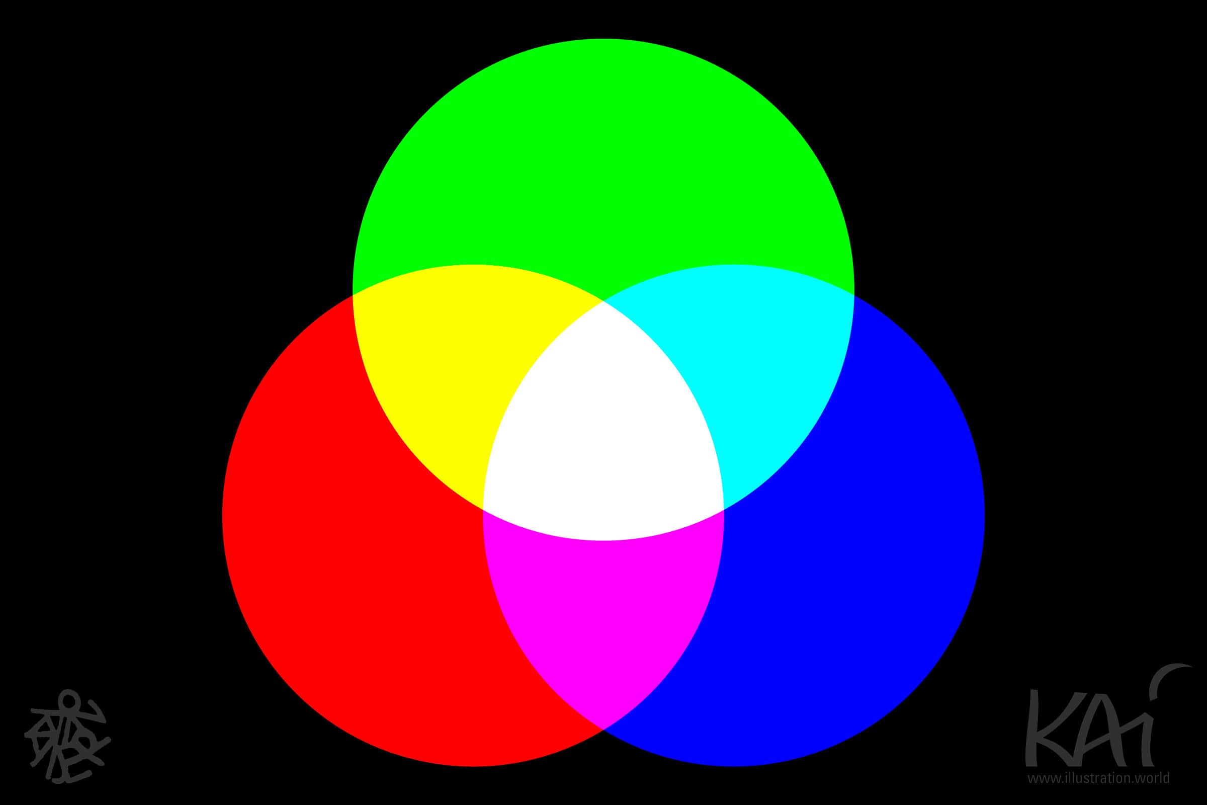
To produce mixtures of light colours, three primary colours are used:
- Red,
- Green and
- Blue (the RGB model).
These are the essential components of additive colour mixing, as they cannot be derived from other light colours and directly correspond to the cone cells responsible for colour vision in the retina.
By combining these in varying intensities, nearly all other light colours can be produced. This principle is fundamental to displays, projectors, and digital systems. Each pixel in a monitor consists of three tiny LED strips in red, green, and blue, whose intensities create different hues.
Secondary Colours in the RGB System
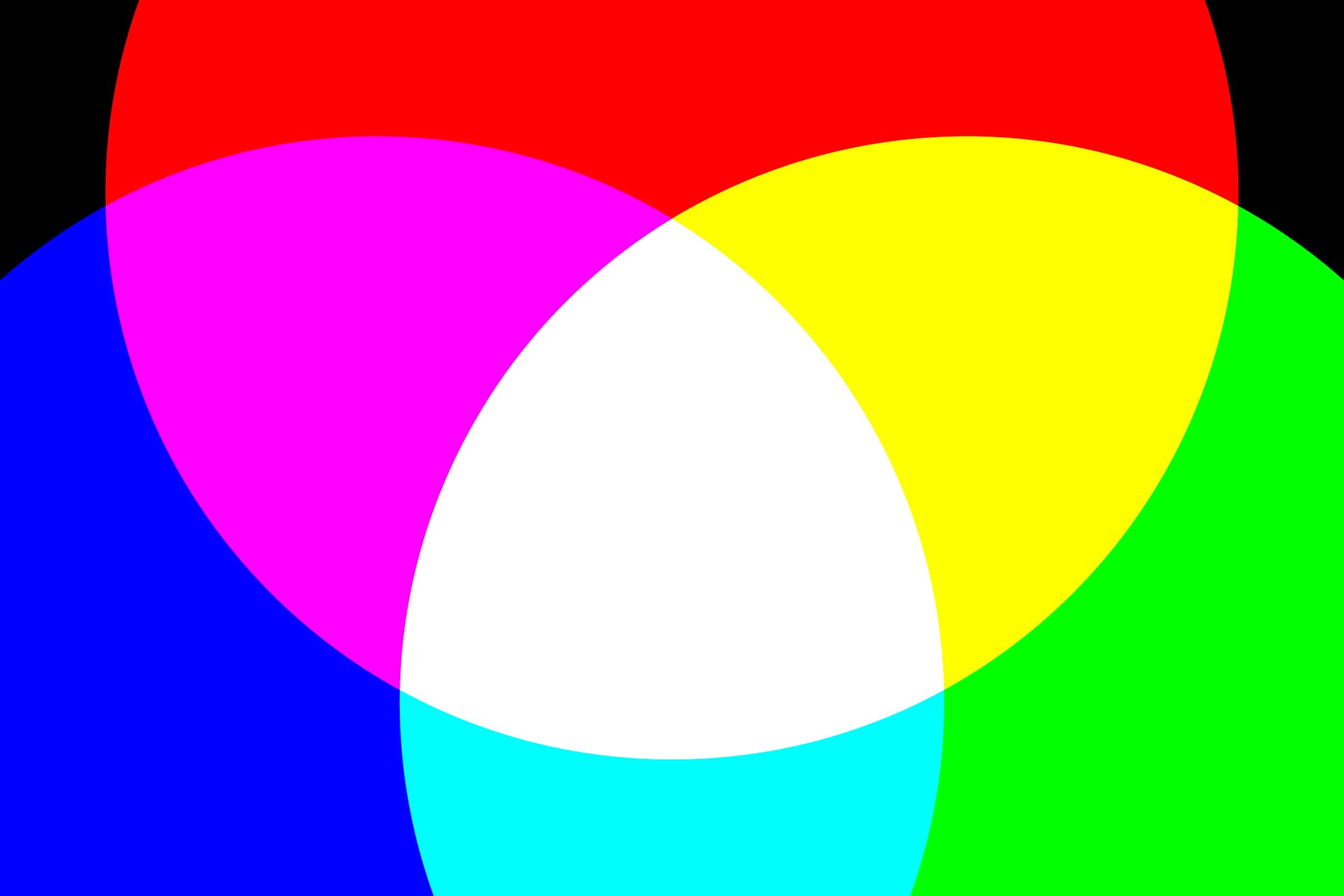
When two primary colours are added (superimposed), they form the secondary colours of the additive RGB system:
- Red + Green = Yellow (Light Yellow)
- Green + Blue = Cyan (Light Cyan)
- Blue + Red = Magenta (Light Magenta)
These secondary colours differ in quality from the identically named primary colours in the CMY system, which pertains to the mixing of pigments or dyes.
Tertiary Colours in the RGB System
Mixing primary colours with adjacent secondary colours produces the tertiary colours in the light system:
- Light Magenta + Red = Purplish Red
- Red + Light Yellow = Orange
- Light Yellow + Green = Light Green
- Green + Light Cyan = Turquoise Green
- Light Cyan + Blue = Blue
- Blue + Light Magenta = Violet
When the full spectrum of light colours is recombined (e.g., through a converging lens), white light is reconstituted. This process demonstrates the additive principle: the more light colours are combined, the brighter the resultant light becomes. This phenomenon is known as additive colour mixing.
White and Black in the RGB Light Colour System
In the light colour system, white and black occupy unique positions:
White results from the uniform combination of all light colours. Its perception is always influenced by ambient light. A “purest white” does not exist, as extreme brightness would dazzle the eye. To protect the retina, the eye reacts by contracting the pupils.
Black is the absence of light. There is no “purest black” in the light colour system, only varying degrees of darkness leading to the complete absence of light, as in a moonless, starless night.
Strictly speaking, white and black are not colours in the light colour system but states: white represents the presence of light, black its absence. Poetically, they symbolise day and night.
Material Colours and Subtractive Colour Mixing
Colours Exist Through Light
Material colours arise from light colours, modified through interaction with materials. Traditional colour theory differentiates between light colours (additive colour mixing) and material colours (subtractive colour mixing). While this distinction highlights differing physical processes, it overlooks the essential dependency on light. The following sections hierarchically integrate these two systems.
Why do objects appear in different colours under the same lighting conditions?
For opaque objects, colour results from surface phenomena: certain wavelengths of light are absorbed, while others are reflected. The reflected wavelengths reach the eye and are perceived as colour.
A blue object, for example, reflects mostly short-wavelength light (blue) while absorbing other wavelengths, typically in the yellow, orange, or red range. Since absorbed light is not reflected, this process is known as subtractive colour mixing.
Translucent materials also influence colour perception by partially absorbing, reflecting, and transmitting light. The light that reaches the eye after these interactions is perceived as coloured due to the missing wavelengths. Partial absorption occurs when some, but not all, wavelengths are absorbed.
Material Colours as a Subset of Light Colours
Material colours, or the colours of objects, exist only because of light. Without light, objects appear colourless, revealing only tactile or measurable surface properties. From a systematic perspective, material colours are a subset of light colours: their perception depends on light modified by reflection, absorption, or transmission.
When illuminated by white light, an object’s surface absorbs specific wavelengths while reflecting others. These reflected wavelengths create the perceived colour. For instance, a leaf appears green because it reflects green light and absorbs blue and red components. In complete darkness, all objects appear black due to the absence of light.
Subtractive Colour Mixing – The Core Principle of Material Colours
Fundamentals of Subtractive Colour Mixing
In the subtractive colour system, colours are created by mixing pigments or dyes. Pigments act subtractively by absorbing specific wavelengths of light and reflecting the remainder. The reflected light determines the perceived colour impression. This principle forms the basis of the subtractive CMY model (Cyan, Magenta, Yellow), which is used in printing, painting, and various other applications.
The Role of the Substrate in the CMY System
The CMY system is based on a substrate—typically paper or another surface—that ideally presents a neutral white to the human eye. The substrate serves as a reflective surface and provides the white point on which subtractive colour mixing relies. If the colours are translucent (opaque), the substrate largely determines the perceived colour representation.
Factors for Colour Definition in the CMY System
To precisely define colours within the CMY system, the following three factors are crucial:
- The white point of the substrate: The white point of the substrate significantly affects how reflected colours are perceived. Standard white papers and surfaces range from yellowish white (warm) to bluish white (cool). This factor is particularly relevant, as the white point defines the foundational perception of reflected colours.
- The surface properties of the substrate: The surface texture of the substrate also influences colour perception. A rough or matte surface absorbs more light, making colours appear darker or more subdued. Conversely, a smooth, glossy surface reflects more light, making colours appear more vibrant. A neutral white paper reflects light more evenly and provides a better baseline for colour mixing than tinted or matte surfaces.
- The lighting conditions: Colours appear differently under various lighting conditions. Therefore, using a defined standard light source (e.g., D50 or D65) is essential to maintain consistent colour perception. Colour shifts under different lighting conditions can cause significant variations in perception. Objective colour measurement employs spectrophotometric analysis, which accurately evaluates the reflective properties of the pigment under standardised light.
The Importance of Pigment Quality in the CMY System
The quality of a CMY colour or definition depends primarily on the pigments used. High-quality pigments absorb unwanted wavelengths more effectively, resulting in purer, more intense colours. A cyan pigment in the CMYK printing standard is a precisely defined colour formulation that balances technical and economic criteria. However, using higher-grade pigments can achieve a better, more intense quality, leading to more accurate colour reproduction and greater saturation.
Order and Role of Colours in Four-Colour Printing
Cyan, Magenta, and Yellow, combined with the white of the substrate, form the fundamental building blocks of the CMY system. Pigments and colours in the CMY system are typically defined in their purest form at 100% colour value, resulting in the most intense and vibrant colour perceptions. The order of notation (CMYK / CMY) follows the conventional sequence in four-colour printing, where cyan is applied first, followed by magenta and transparent yellow. This sequence is essential for efficient colour mixing, as each subsequent layer adjusts and enhances the colour spectrum further.
The Key Role of Black in Four-Colour Printing
In four-colour printing, the black printing plate (Key Plate = K) is added to give the image depth and detail by intensifying dark areas and contrasts. Black is referred to as “Key” because it not only enhances the final tone but also defines the fine details and shadows that cannot be achieved with pure CMY colours alone. Using black ensures a precise structure in the printed image, distinguishing it from purely subtractive colour printing and enhancing the visual clarity of the reproduction.
Variability of CMY Colour Perception
However, CMY is not universally consistent. Variations in pigments, substrates, and lighting conditions lead to differences in colour perception. Therefore, the conditions under which CMY colours are used, evaluated, named, or measured must be clearly defined.
The Principles of Subtractive Colours
The quality of subtractive colours depends on the properties of the pigments, the substrate, and the lighting conditions under which they are viewed. These principles form the foundation of subtractive colour theory and bridge the gap between physics and perception, enabling practical applications in various fields.
Primary Colours of the CMY System
The CMY system comprises three primary colours, each absorbing specific wavelengths:
- Cyan: Absorbs red light, reflects green and blue.
- Magenta: Absorbs green light, reflects red and blue.
- Yellow: Absorbs blue light, reflects red and green.
All other material colours can be produced by combining these primary colours. The substrate acts as the “fourth colour,” significantly influencing the final result. In practice, substrates often exhibit slight yellowish or bluish whites, as is common with paper.
For lighter or pastel tones, opaque white pigment is frequently added. To achieve more intense colours and approximate the brilliance of light colours, additional tones like deep black or neon shades (e.g., neon cyan, neon magenta, neon yellow) are employed in printing. In painting, diverse pigments, often derived from natural sources, are used.
The Physics of Subtractive Colour Mixing
In theory, mixing cyan, magenta, and yellow should produce pure black, as all light wavelengths are absorbed. In practice, however, the result is often dark brown or grey, due to imperfections in pigments. To optimise this, printing processes include black as an additional colour, resulting in the CMYK model (Cyan, Magenta, Yellow, Key = Black).
Secondary Colours in the CMY System
By mixing two primary colours, the secondary colours emerge:
- Cyan + Magenta = Blue-Violet
- Magenta + Yellow = Red
- Yellow + Cyan = Green
Tertiary Colours in the CMY System
Tertiary colours arise from mixing a primary colour with a secondary colour. These intermediate hues vary in their characteristics depending on the mixing ratio of the two colours. The primary and secondary colours can be arranged in a traditional colour wheel, which illustrates the transitions between colours. Examples of tertiary colours in the CMY system include:
- 50% Yellow + 100% Cyan = Green
- 100% Yellow + 50% Cyan = Turquoise
- 100% Cyan + 50% Magenta = Blue
- 50% Cyan + 100% Magenta = Violet
- 100% Magenta + 50% Yellow = Light Red
- 50% Magenta + 100% Yellow = Orange
These intermediate tones represent a broader palette that lies between the secondary colours and forms the transitions between the purer colours.
Earth Tones and Pastel Colours
Colours whose brightness is altered fall into two categories:
- Pastel Colours: These are colours lightened towards white. Common examples include pink, light yellow, or light blue.
- Earth Tones: These are colours darkened towards black. Examples include olive green, ochre, rust red, or dark violet.
Brown and Grey are special cases, resulting from the combination of all primary colours.
Pastel tones and earth tones are characterised by lower intensity and typically appear soft or subdued. They play a significant role in art and design for creating moods and conveying subtlety.
White and Black in Material Colours
White and Black from a Physical Perspective
White results from the complete reflection of all visible wavelengths at a material surface. Perfectly white surfaces scatter light evenly in all directions. In physics, white is considered a state of maximum light reflection. Since it is not associated with any single wavelength, it is not classified as a colour in the strict physical sense.
Black occurs through maximum light absorption, with virtually no light being reflected. Materials like Vantablack, which absorb up to 99% of incident light, appear almost entirely black. In physics, black is a state of maximum light absorption and, like white, is not considered a colour in terms of wavelength specificity.
White and Black in Perception
In human perception, white and black surfaces are experienced as colours. They are part of the visual spectrum interpreted by the brain. White and black occupy the extremes of the spectrum, lack a hue, and are therefore classified alongside neutral grey tones as achromatic colours. In contrast, colours with a hue are termed chromatic colours. Achromatic colours are foundational in art, design, and architecture.
White and Black in the Colour Canon
From a physical standpoint, white and black are states of light interaction. In colour theory, however, they are viewed as achromatic colours with vital compositional and design functions. These perspectives complement each other, underscoring the significance of white and black in the colour canon.
White and Black are Colours – A Call for a Holistic Approach in Design Education
The common assertion that white and black are “not colours” is untenable within the realms of art and design. Instead, they are fundamental elements for contrast, spatial depth, and compositional balance. This misconception, often perpetuated in educational contexts, contradicts a holistic understanding of colour that integrates both physical and aesthetic dimensions.
– KAI
© Kai Jerzö, Utrecht, December 9, 2024 –
Citation
Quote? Yes, with pleasure as follows:
– Jerzö, Kai (2024): ‘Perceiving and shaping – Competence in Colour Design: Color Phenomena.’ 2024-12-09. In: Illustration.world-Blog, 2024-12-09. URL: https://illustration.world/design_competence_colour_4_en/ .


